Dark mode for NHS 111
This is a set of local notes from the ones I added to the github issue discussing implementing a dark mode across the NHS design system.
We looked at Dark Mode a little while ago, here is what we found.
(There’s a bit of conversation here, and compromise explored)
Some users have mentioned it in feedback comments and user research for a long time. Some users were forcing dark mode on their browsers using a plugin. Using that plugin, it looks like this:
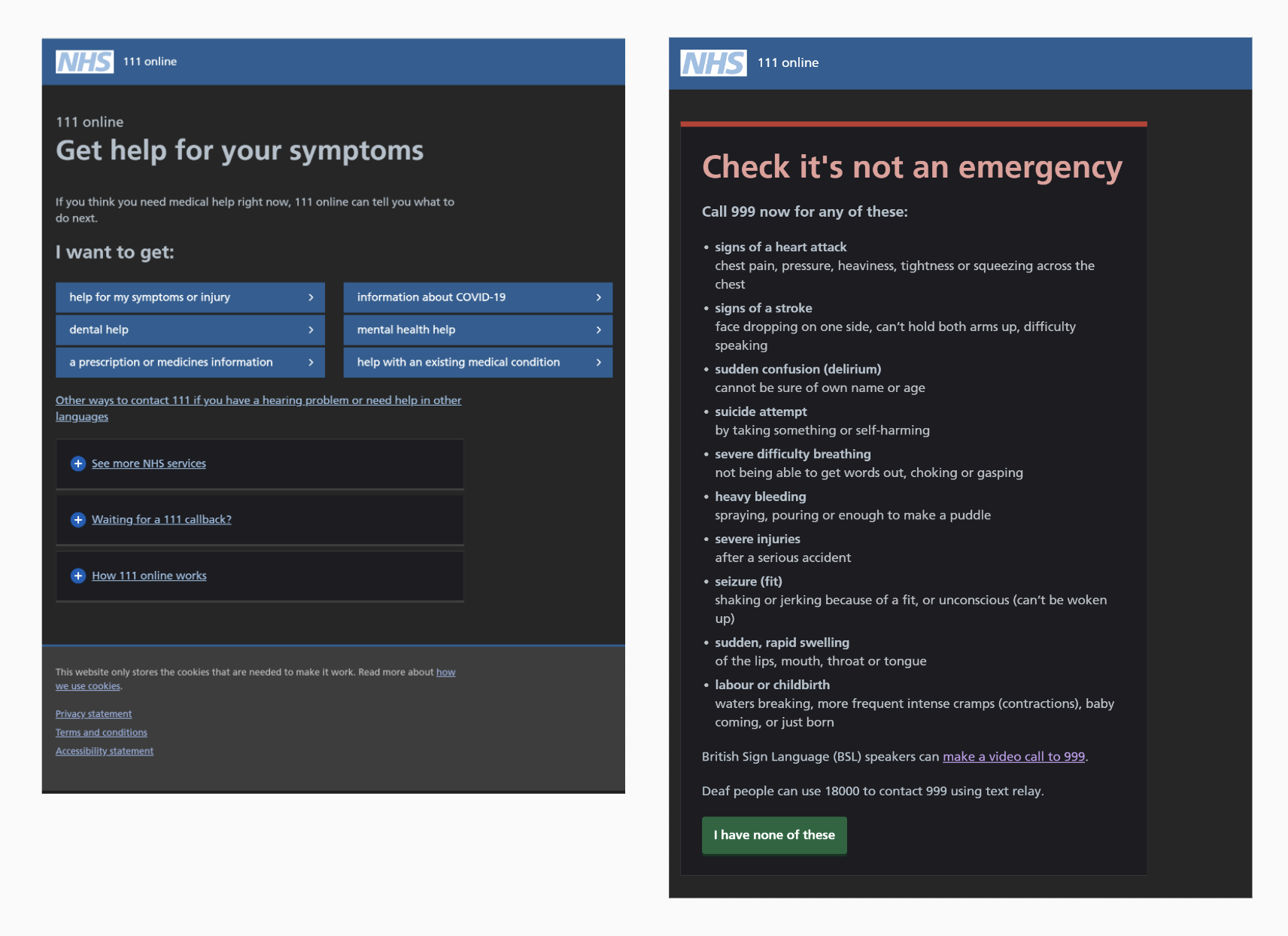
Clearly if filled a need, but there are quite a few issues with it, so surely we could do something better.
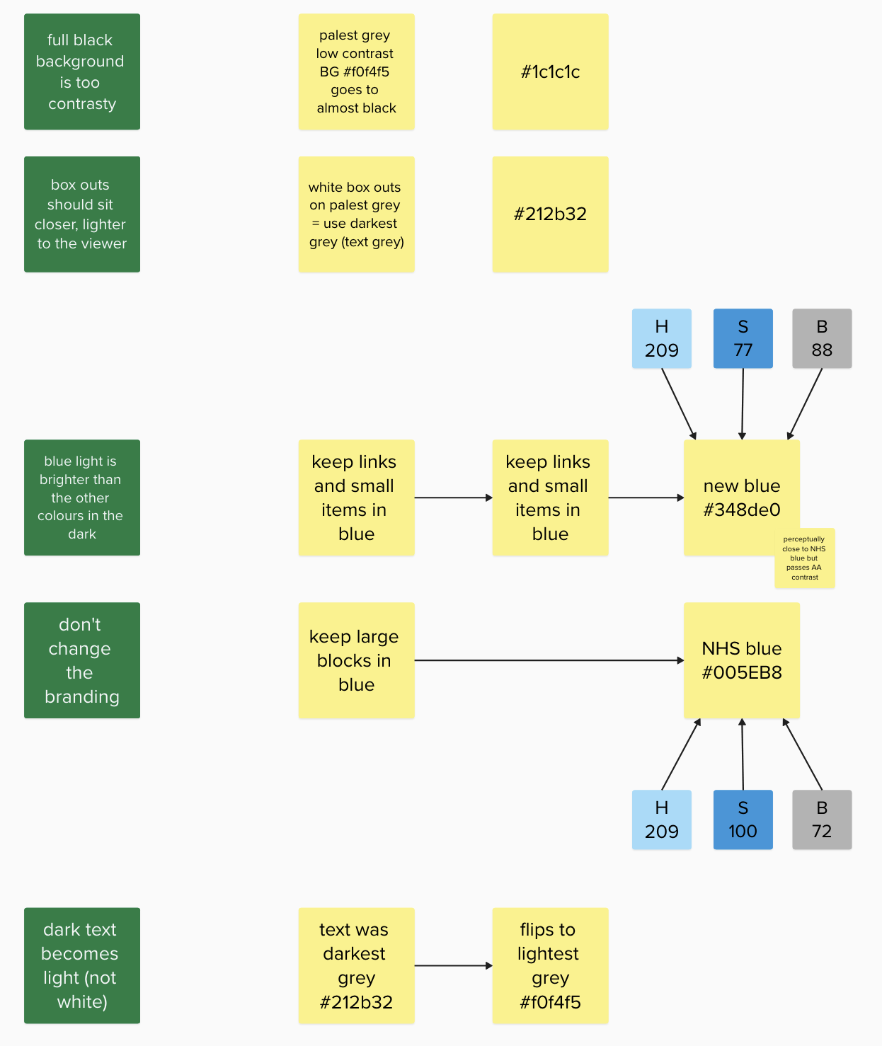
It’s important to remember that users might not choose black (if given the option) for the dark mode background, as this can introduce harsh contrast issues. Their choice might be about the screen emitting less light overall, but not about maximising contrast.
The first issue is the NHS blue on dark and/or black is a complete failure.
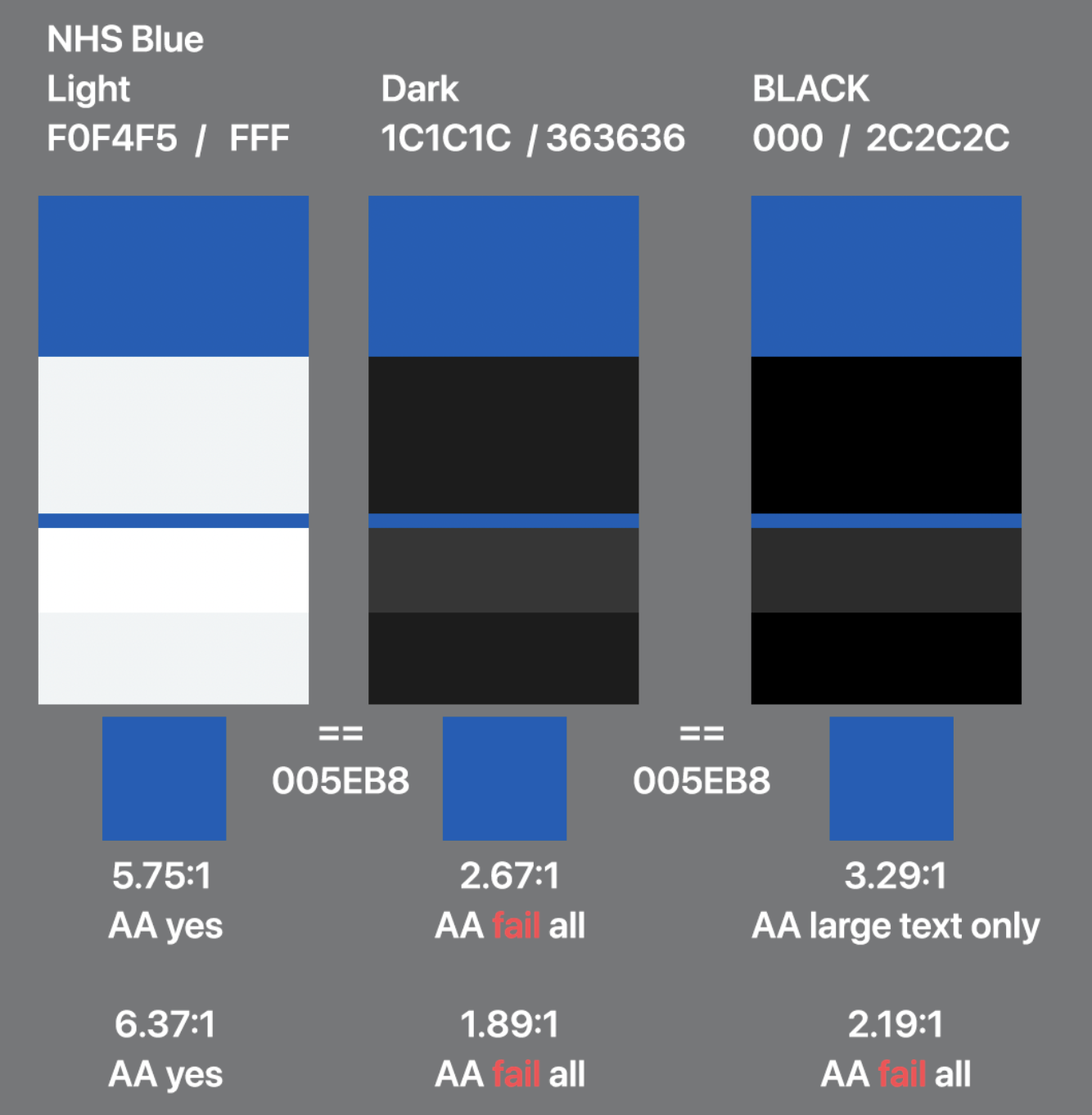
We use the blue on text links, so that’s going to be the first problem. Going all out for AAA contrast of the NHS blue is going to be a little bit nasty:
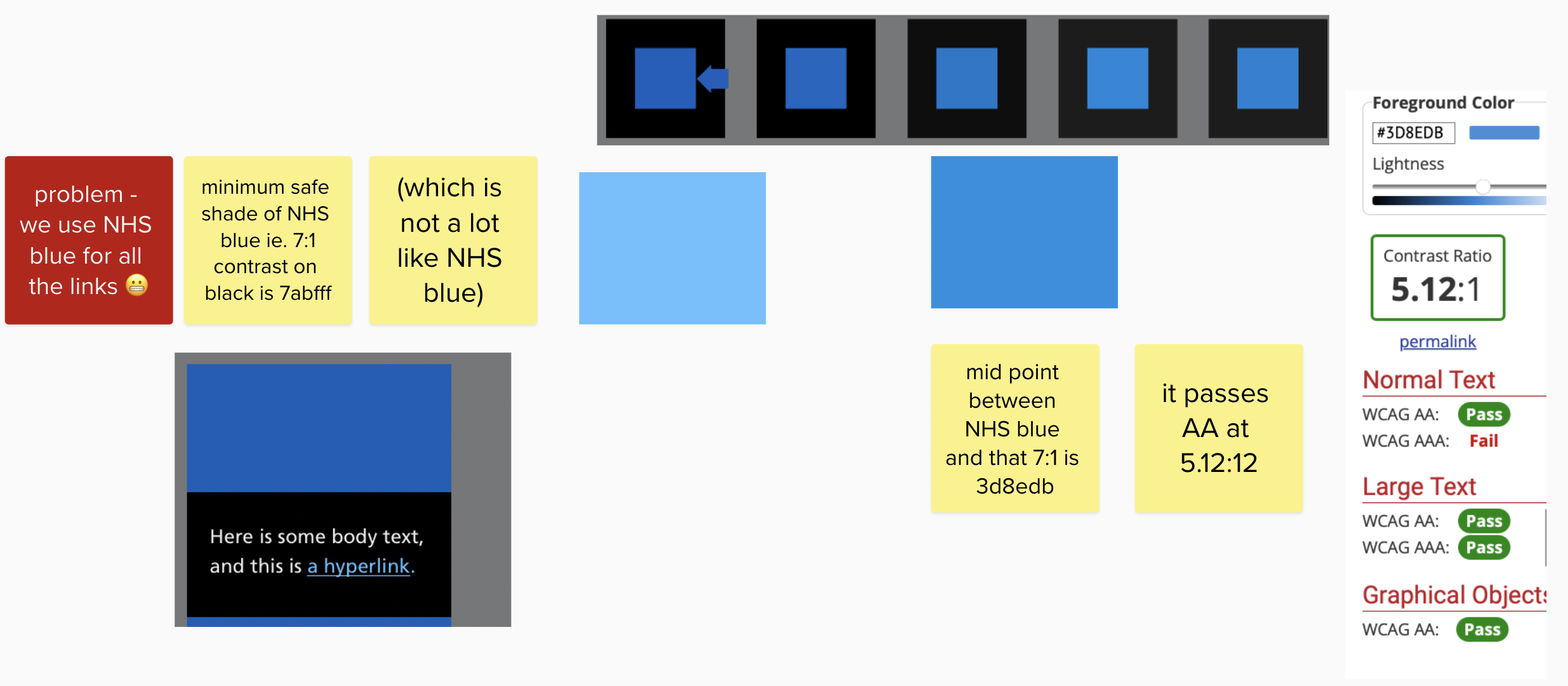
Bearing in mind that the human eye is more sensitive to blue light than other parts of the spectrum, this seemed reasonable. I made a mockup with a visually comparable blue (along with using darker images in dark mode!)
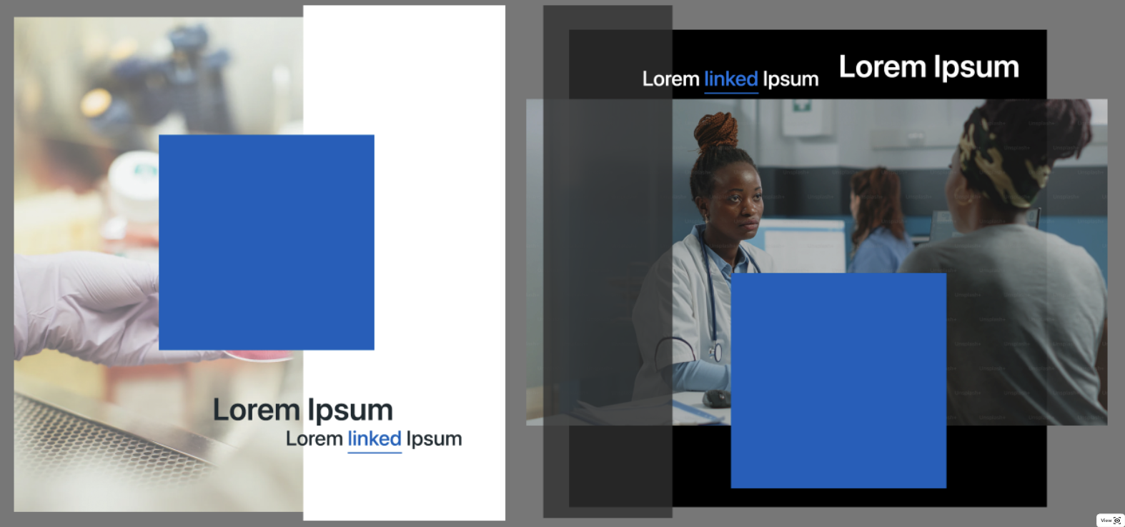
Following this I came up with a set of compromise colours that might work in harmony to recreate our page in dark mode while keeping the feel of it. This meant a new blue, that was perceptually close to the NHS Blue but passed at AA - #348de0
This also introduced the need to detect the accessibility setting for high contrast, and offer a definite high contrast option:
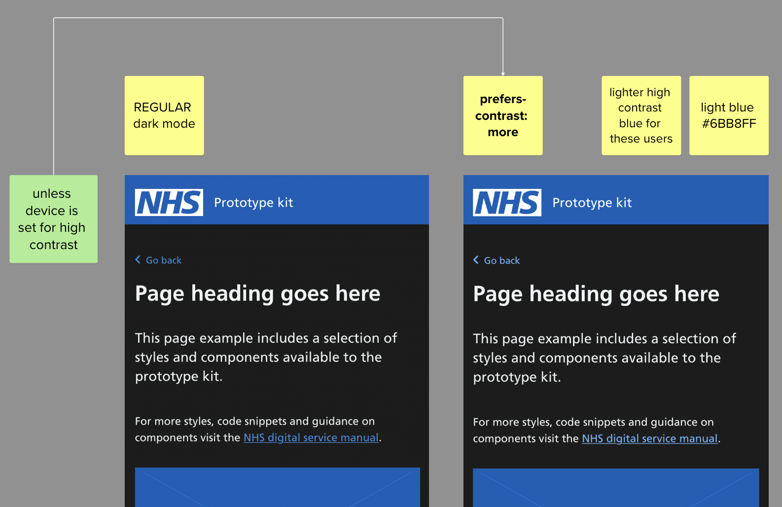
This can be detected in a media query using the css prefers-contrast
eg.
@media (prefers-contrast: more) {
.contrast-enabled-box {
    outline: 2px solid white;
  }
}
I added a few more elements, with tweaked high-contrast versions and assembled a long page with a range of items.
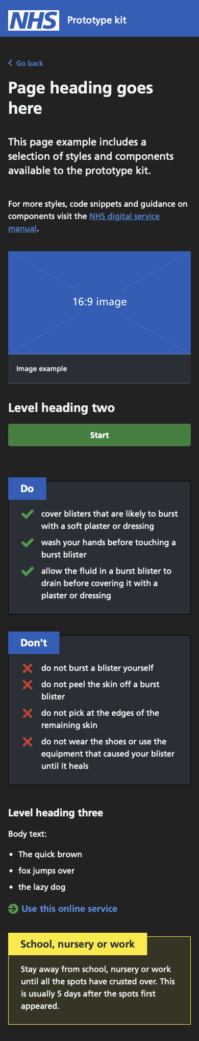
High contrast above, note the addition of borders to the boxes to really pick those out, and the much brighter green, red (pink) and blue items.
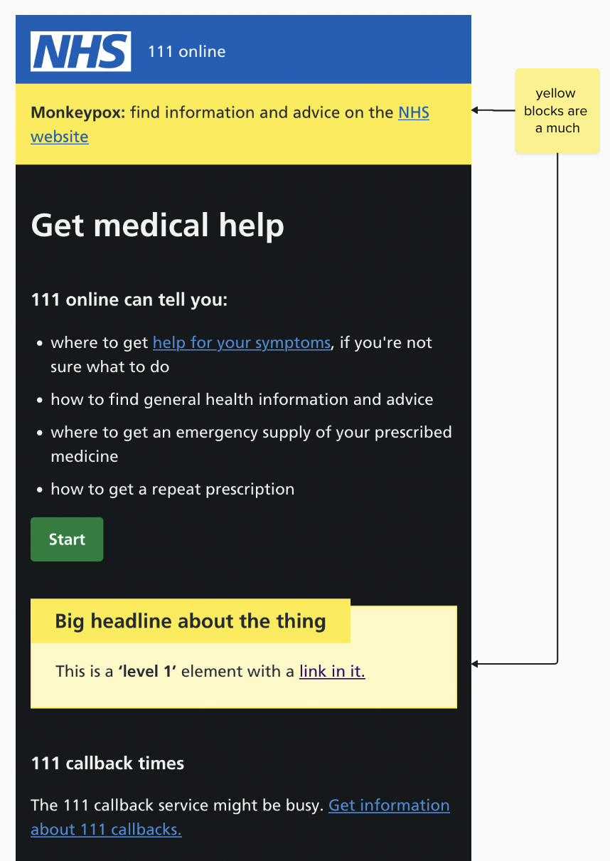
The big yellow banner was particularly problematic, so even though technically just bringing the colour across would “work” it is emitting far too much light for a dark mode.
In summary though, due to the extensive use of webviews of parts of NHS.UK within parts of the NHS App, doing these things just for NHS 111 was deemed not possible. All sites or none, appears to be the blocker for an NHS dark mode.