Pentagram – Five
Pentagram continues! It’s 1999, exciting times – early days of the New Labour government, the end of the Clinton era, the dot com boom! And here is another telephone directory sized volume of work. 50 solid case studies in fact fill out the 500 hundred pages covering the period between 1993 and 1998.
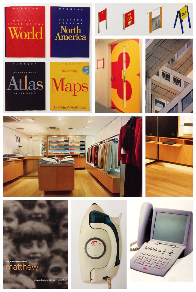
So we have some extremely tasteful packaging, modern with just the right amount of classicism to fit timelessly on the shelves.
That international slick and corporate yet homely country kitchen style? Pentagram nailed that. The wide tracked type filling each line. Nailed. The curvaceous pastel plastic household electricals? Nailed. The tactile, eye burning electro-pop record cover? Er… nailed. Number of websites? Zero. Number of user interfaces? Zero. Ah.
The introduction is an interesting piece, exposing the slight fib in early Pentagram days about their organisation and inherent collaborative nature. Turns out, they didn’t really do it: the partners pretty much ran distinctly separate practices under a red umbrella. Described are the steps the firm took to expand into the US, and embrace their second generation. With extremely tight graphic design, mostly for print, packaging and signage fully represented hindsight suggests a small digital blindspot.
Still, a cracking telephone directory. Remember telephones? Anyway, prices vary widely from cheap to not so cheap on Amazon used.

