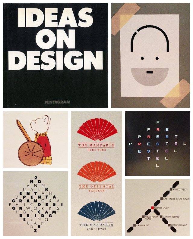
Pentagram – Ideas on Design
Hardcover this time – fancy. So here we are in 1986, and Pentagram must have been really busy because they appear to have phoned this one in. No analysis of design agency life, but a tepid introduction from ad man Peter “Year in Provence” Mayle – how very 80s.
As a picture book of the work, it feels a bit thin, relying on graphic design much more heavily than in earlier collections. The pages are sparse, not so much packed with insight and drawings, works in progress or unfinished concepts.
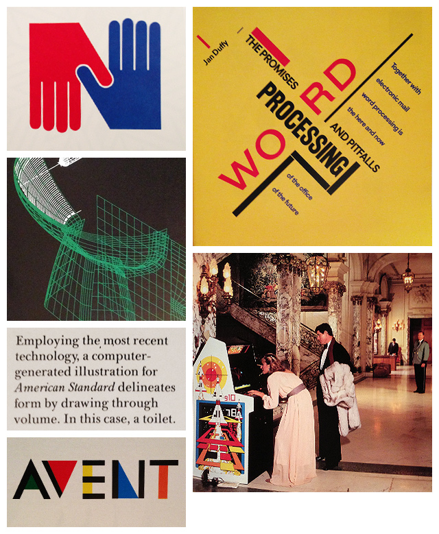
The influence of new technology in their most primitive forms are beginning to be felt, but not yet deeply understood. Even the logotypes turn out less timeless and more style over substance. The 80s.
But even here, on a bad day, Pentagram still throw down a few legendary shapes. Their worst is better than many others best.
This first proper coffee-table design book sold loads, so used copies are available literally for pennies..

