The Grid
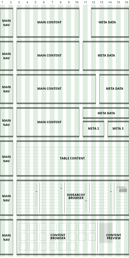
Sixteen Columns
The new design uses a sixteen column grid, designed to fit well on a 1280 wide screen. This provides quite a lot of flexibility in layouts, allowing extra width for tables while still providing room to move the top level navigation into a vertical list on the left hand side (rather than fitting this into horizontal tabs).
Main text content should usually define it's own column width by using readability of line length as a measure. This body text is at a very readable 18pt size, and the line lengths are around 80 characters which works out at 8 columns out of 16. While characters per line studies have proved inconclusive, this number has been arrived through the evolution of books (60-70 cpl) and the typewriter (70-80 cpl), IBM punchcards and early computer screens.
The meta column on the right less often needs multi-line body text, so 14pt and 60 characters provides a good space for lists, titles and links across 4, 5 or 6 columns leaving two for the navigation on the left. This could be sub-divided for different uses too.
Wide loads
Where maximum horizontal content is required for tables or a hierarchy browser, the full 12 column width provides 1034 pixels, more than the entire screen area on 960px / 1024px based screen designs.
Complex layouts
The same grid will be used for newsfeed style pages for dashboards and projects - will summarise here when those are designed
Some example layouts using the 16 column grid